
9/11 Memorial
The events that occurred on September 11th, 2001 have left an indelible mark on our country. Most Americans can remember where they were the moment they heard the news, the color of the sky, and as a nation we mourned for the victims.
When we were tasked with the project to create a visual expression for the 9/11 Memorial organization we approached it with reverence. It was a full studio project, each person contributing how they could. Ultimately my logo was chosen, and we were able to introduce the foundation to a new shortened name, simple, powerful wordmark and visual identity.
NAME
Then known by its legal name “National September 11 Memorial and Museum at the World Trade Center” we presented a variety of shorthand names, to create a more immediate and memorable impression.

LOGO
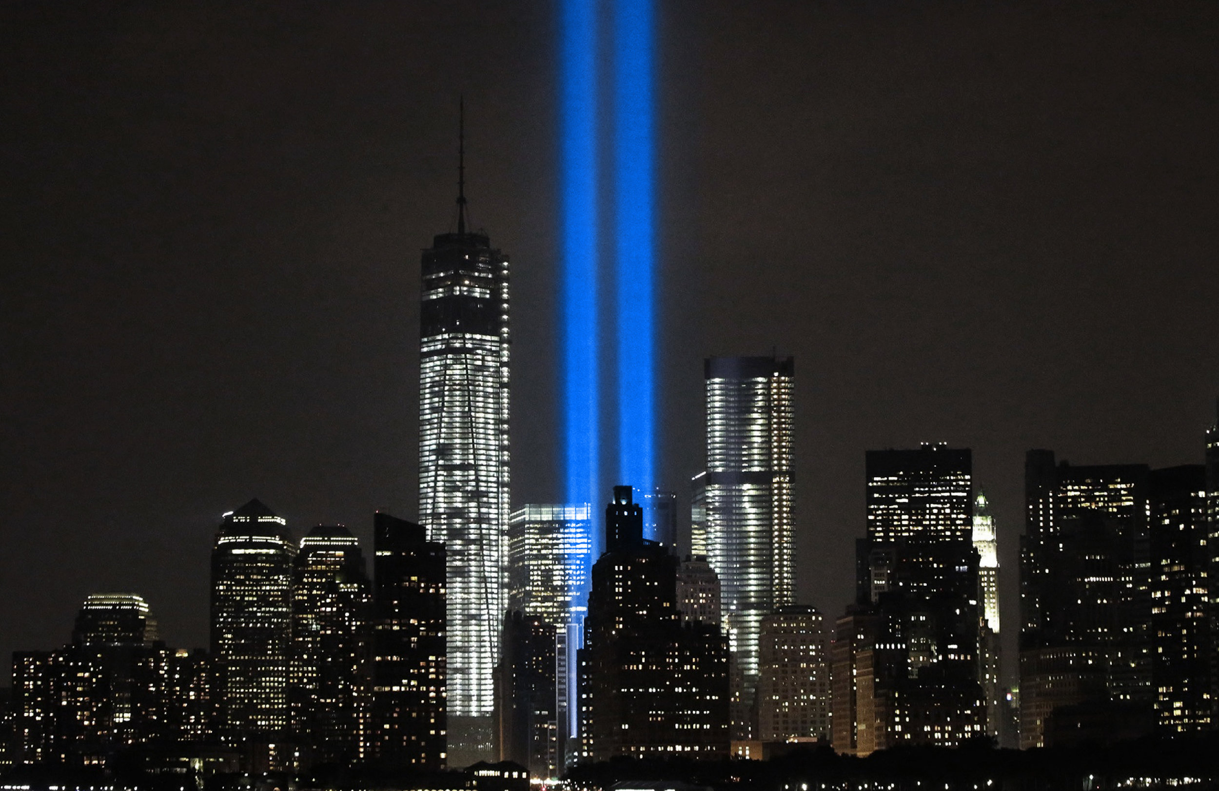
The 9/11 Memorial logo showcases two simple pillars in a sky blue color.
They represent the space in the sky where the towers once stood.

EXTENSION
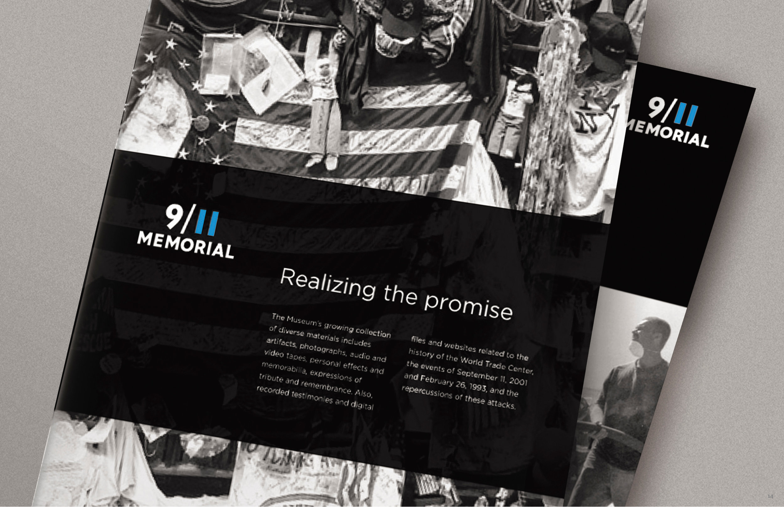
The new identity includes a logo and visual system. The design was applied throughout the museum, on print and digital media.

TYPOGRAPHIC CONTROVERSY
The identity launch lead to several New York Times articles, one about city signage, and the other, a dialogue about how the wordmark was created as a hybrid of two NYC-grounded typefaces: Gotham and Verlag.

The new logo for the memorial is featured generously throughout the area surrounding the former World Trade Center site. This includes the first placement of a logo within the exclusively typographic signage system in the New York subway.

The typefaces selected for the redesign include Gotham and Verlag, two typefaces by the same foundry, whose origins lie in New York City architecture. Gotham was inspired by Port Authority signage, and Verlag was initially commissioned by the Guggenheim to mirror the lettering on the museum.

RECOGNITION
The redesign has been met with great reviews and won a variety of design awards, including a shortlisting at Cannes, but the best acclaim of all, is that the logo was featured in Jay Z’s Empire State of Mind.
CREDIT
DESIGN: RIETJE BECKER
DESIGN LEAD: RIETJE BECKER
PROJECT LEAD: CRAIG DOBIE
NAMING LEAD: JASMINE TANASY
COMPANY: LANDOR